🖋 A Look into Aptos, Microsoft’s New Default Font#

icrosoft has been planning a design revamp when it comes to the typography of their whole Office product line; and probably beyond that. They have worked on selecting their new default font for quite a bit[1]. The finalists among which the successor to the familiar Calibri typeface[2] was to be chosen were long known: Bierstadt, Grandview, Seaford, Skeena, and Tenorite. The decision, however, hadn’t been made and apparently no winner was yet selected nor known. That all changed today, though, as The Verge has reported [3].
Interestingly enough, a Tildes user was kind enough to remember 🎭 Best Fonts for Programming and let me know about this cataclysmic and highly relevant event [4]. Whether they were trying to thirst-trap me into providing them entertainment in the form of a font comparison they could click through in-lieu of doom-scrolling, I guess we’ll never know, but it seems to have worked.
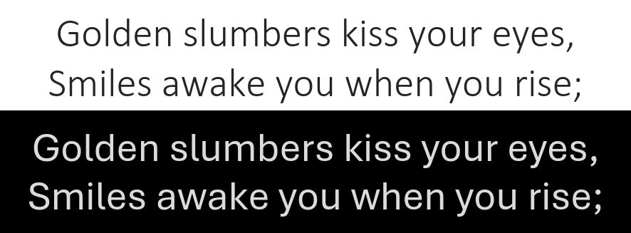
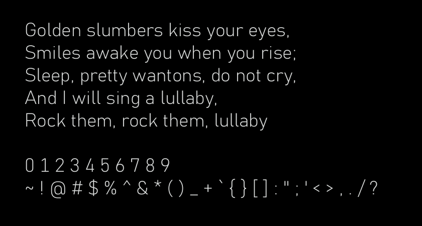
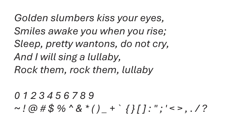
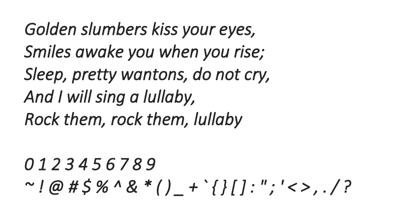
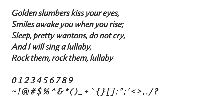
Calibri Light over Aptos, formerly Bierstadt#
This is a comparison for those who wondered what the main differences between the finalist fonts were. The typefaces were used as available in Microsoft’s Office 365 platform at the time of publication. This time around I’ll refrain from commenting much, besides telling you that I find Skeena Display quite appealing and have considered replacing Baskerville for the headings throughout the site. Aside from that, Tenorite is definitely a favorite of mine, but those of you who resent Calibri for its roundness will surely disagree.
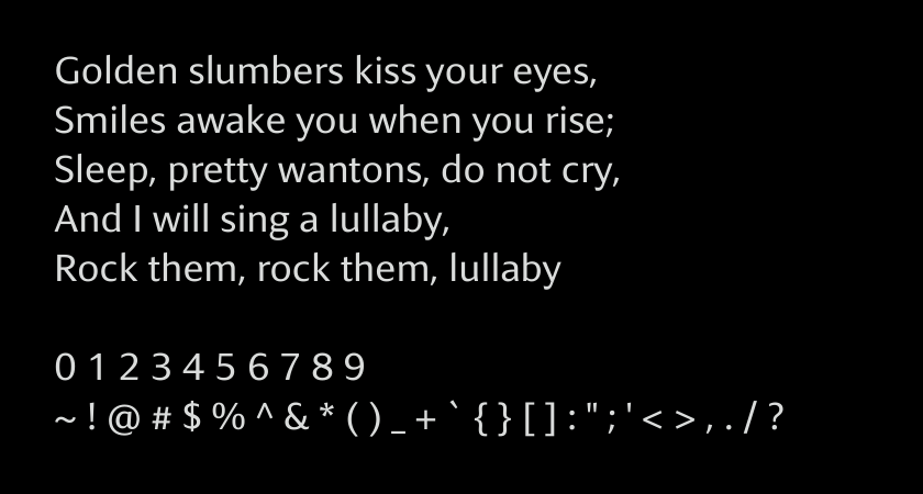
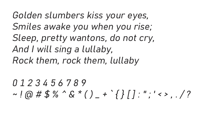
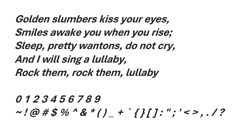
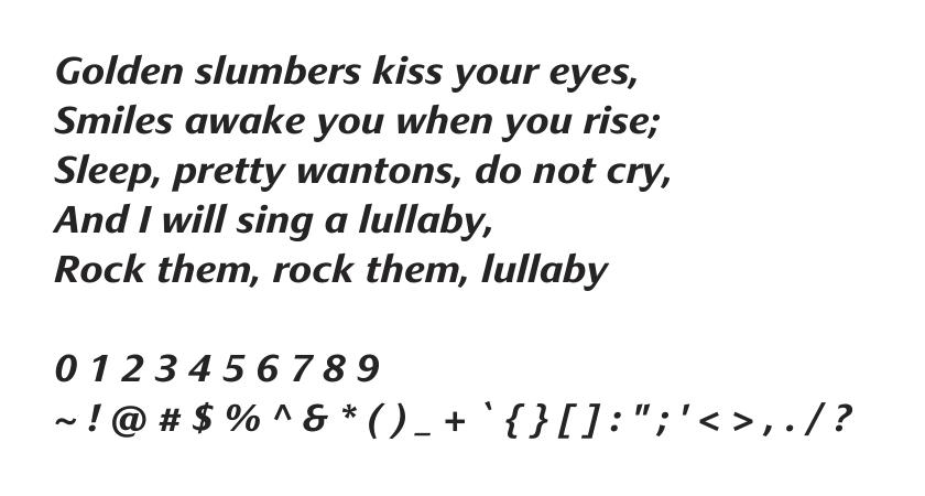
Calibri Light Bold and Aptos on the Office 365 Editor#
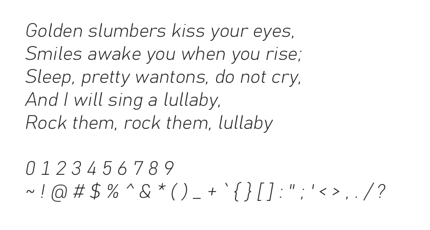
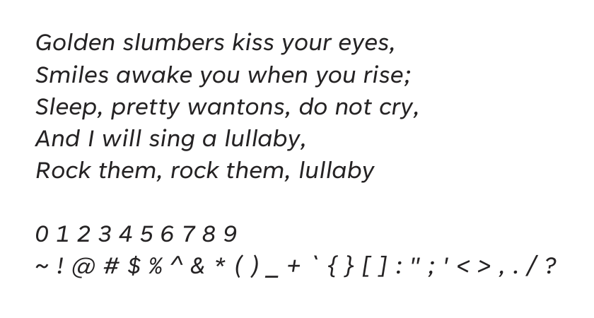
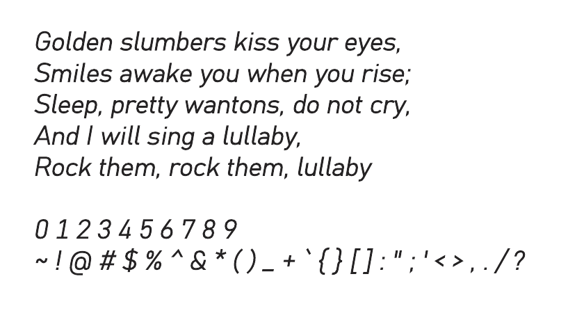
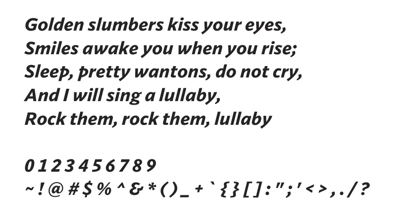
Without further ado, here’s the comparison for you to click through and try to discern why oh why your favorite typeface wasn’t picked and Aptos won instead. I hope you enjoy it!
Stay in touch by entering your email below and receive updates whenever I post something new:
As always, thank you for reading and remember that feedback is welcome and appreciated; you may contact me via email or social media. Let me know if there's anything else you'd like to know, something you'd like to have corrected, translated, added or clarified further.
Addendum#
Once you’re done reading this article, you can continue by having a look at the related content I’ve linked below.
Main Differences#
At first glance it might be hard to perceive the actual differences between Calibri and Aptos, so I’d like to point out the three which were most obvious to me. Although these may seem like minor changes, and as is typical with typography in general, but they do affect the readability and appeal of a text when used. To me Aptos does definitely feel more readable than Calibri.
About Serif and Sans-Serif Fonts#

In theory both Calibri and Aptos are sans-serif fonts with, obviously, no serifs at the end of their strokes. Serifs are additional strokes at the end of a stroke’s terminal[5]. Therefore, it doesn’t make much sense to discuss serifs in the context of Calibri, Aptos as well as the other contenders. Nevertheless, Aptos has a somewhat serif-y quality to it, almost like Alegreya or Andika do. Its terminals are so extended and curved, such that the look and feel is slightly similar to that of a serif font. Despite that fact, we’ll discus terminal length and prominence as opposed to “imaginary” serifs.
Terminal Length and Style Variety#
One of the first observations I made when reading the Verge article was that Aptos’ strokes were much less diverse than Calibri’s. As shown below, the stroke length for E,F, and G all were different and reached different points relative to the glyph’s bounding box or its center. For that reason, we’re moving onto bro-science territory here, I believe Aptos feels more predictable, and thus readable, than Calibri.
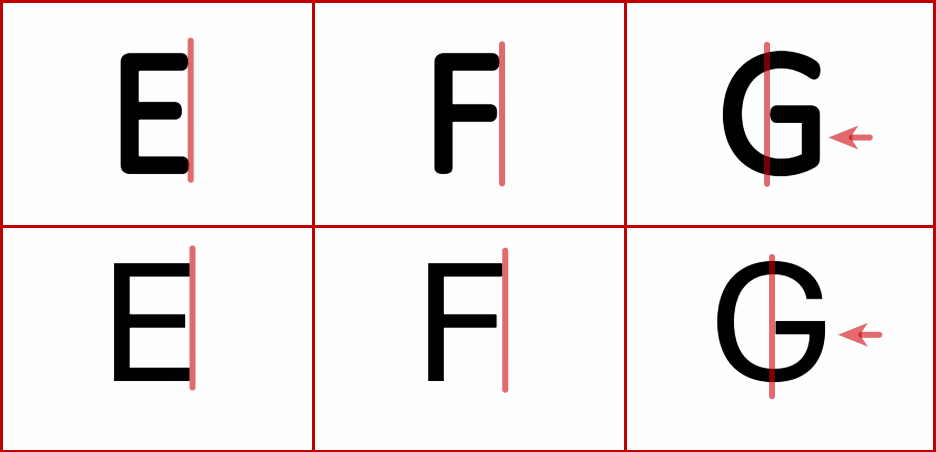
E, F, and G in Calibri Light Bold, on top, and Aptos, on the bottom.#
Terminal Prominence#
Noting and discussing terminal length and style variations probably seems like splitting hairs. However, and along that line, terminal prominence does seem like a more fundamental change in Aptos relative to Calibri. Observe how long and curved, relatively speaking, Aptos’ terminals are. Interestingly enough I don’t think Aptos’ prolonged terminals work against its readability, they even, in my humble opinion, seem to make it more readable.
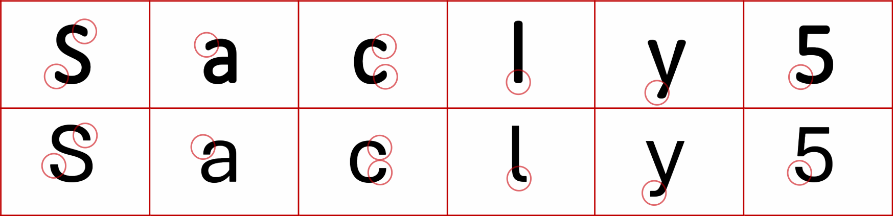
Capital s, a, c, l, y, and 5 in Calibri Light Bold, on top, and Aptos, on the bottom.#
Bearings and Kerning#
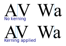
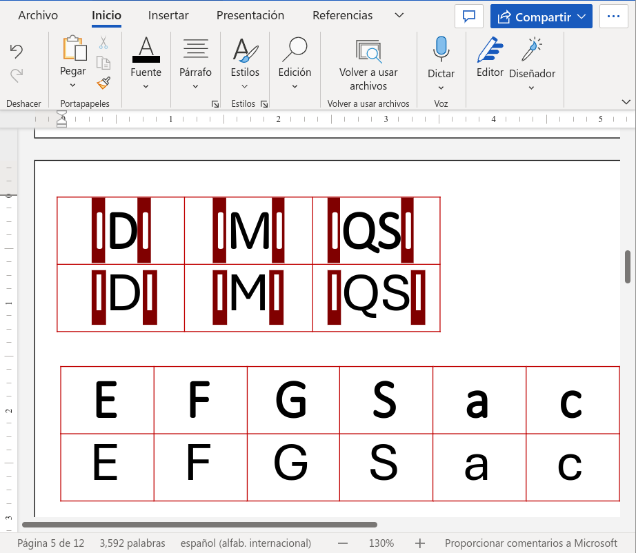
Finally, there were some pretty considerable changes regarding kerning and lateral bearings. As you can see, the amount of empty space surrounding each glyph, so-called bearings, changed quite a bit. To me it seems like Aptos’ characters are better and more uniformly centered. Although for the most part the bounding boxes of the glyphs didn’t overlap previously with Calibri, also referred to as kerning, that was indeed the case with characters such as Q and S. The changes for those are, as can be seen, considerable.
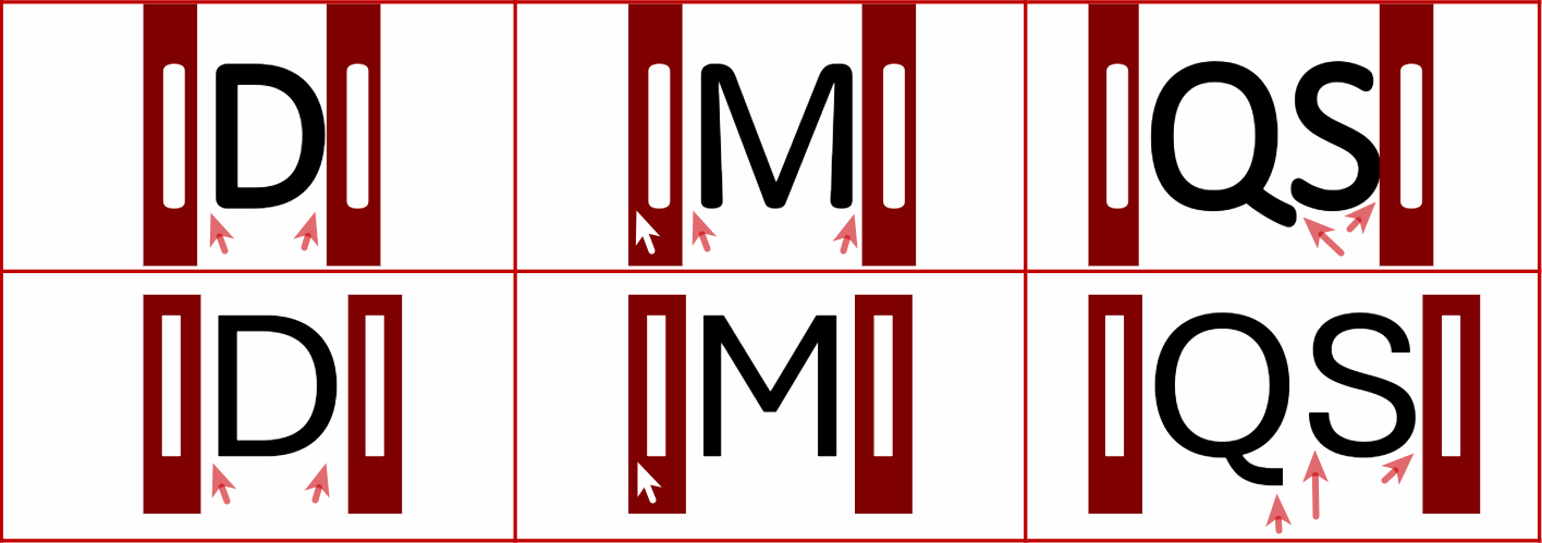
IDI, IMI, and IQSI in Calibri Light Bold, on top, and Aptos, on the bottom.#
Comparison#
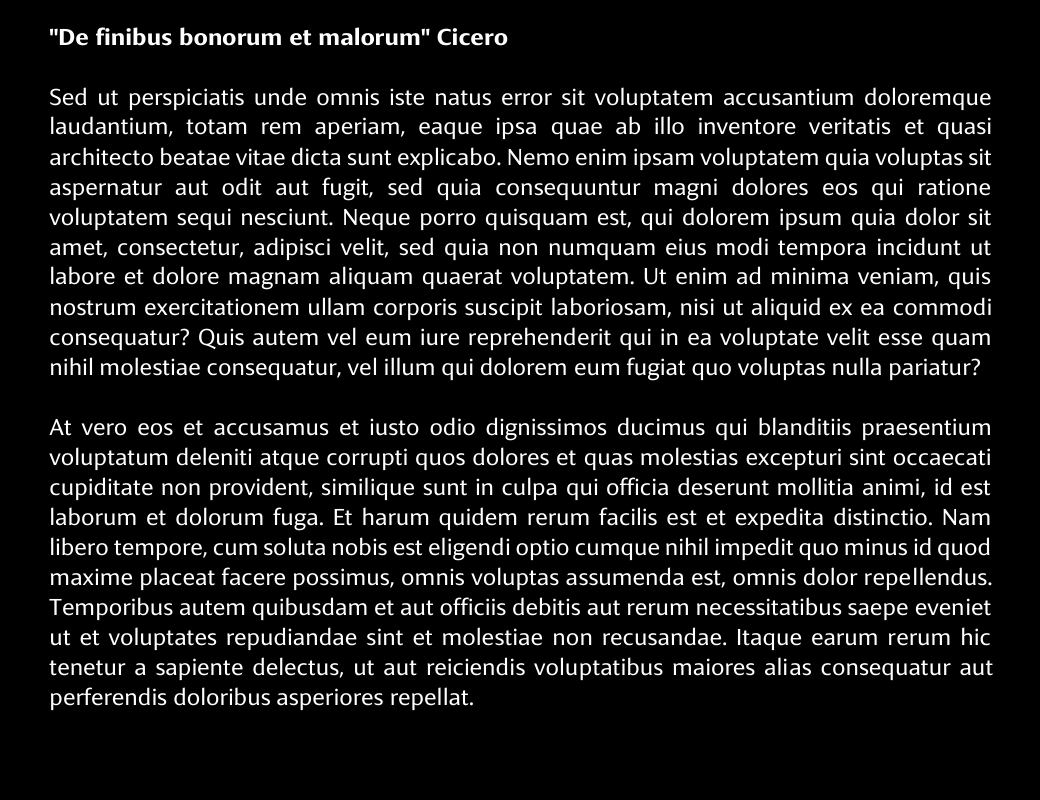
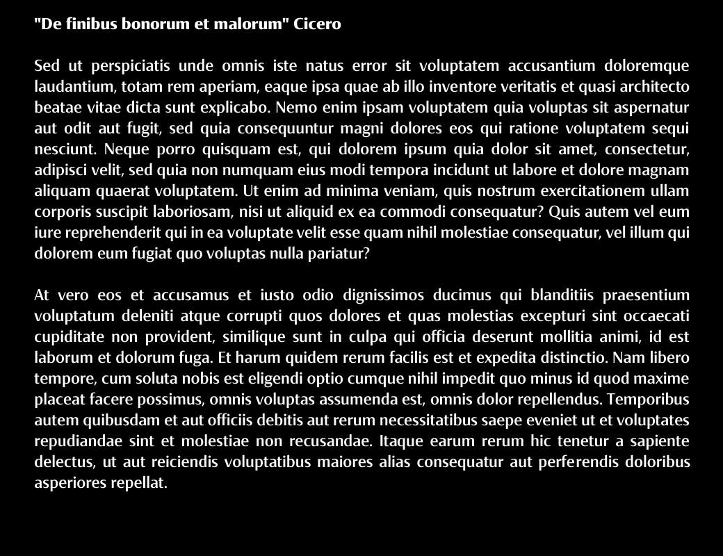
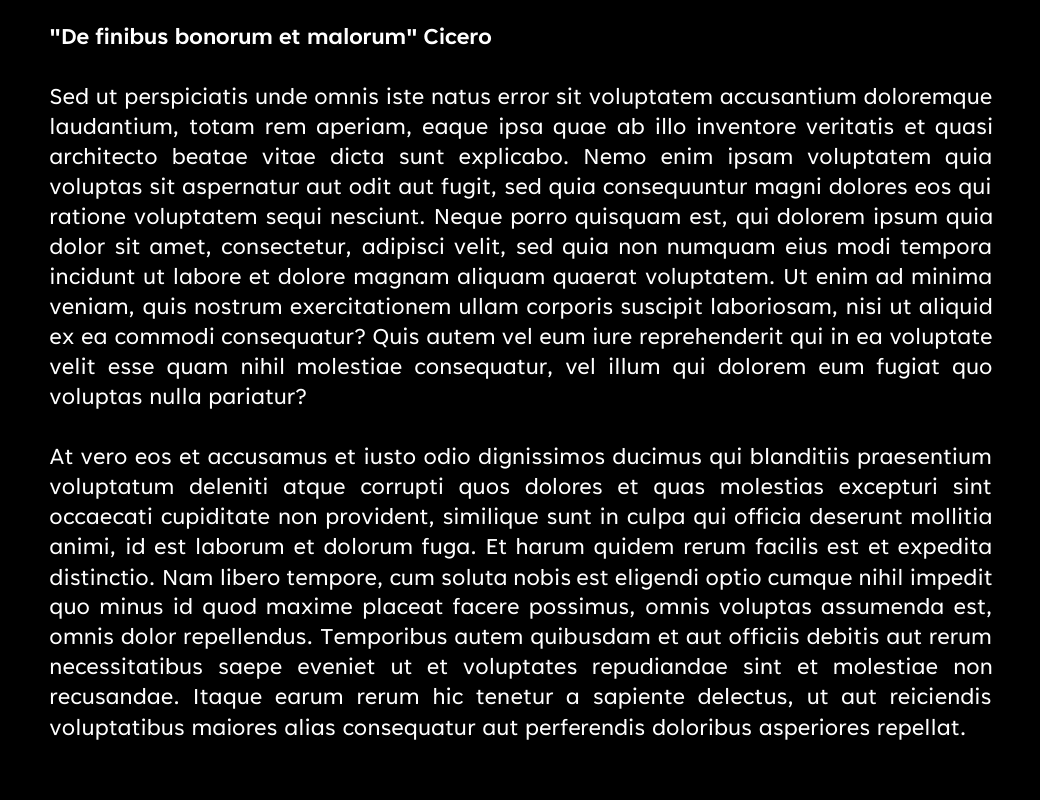
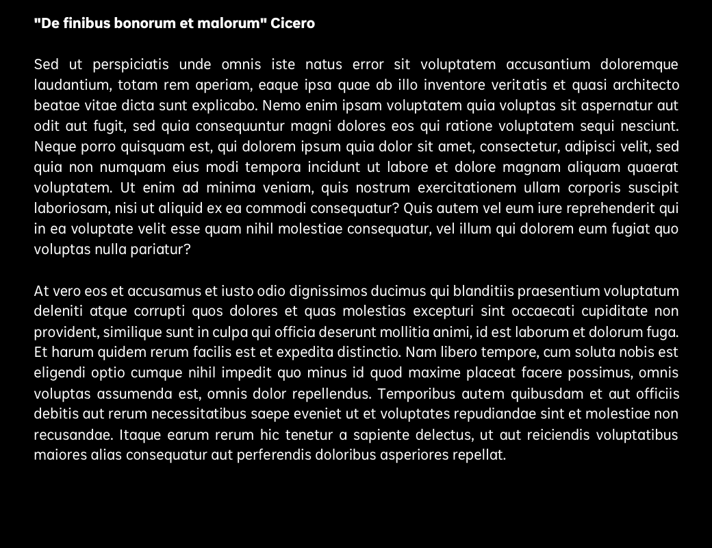
Lorem Ipsum#
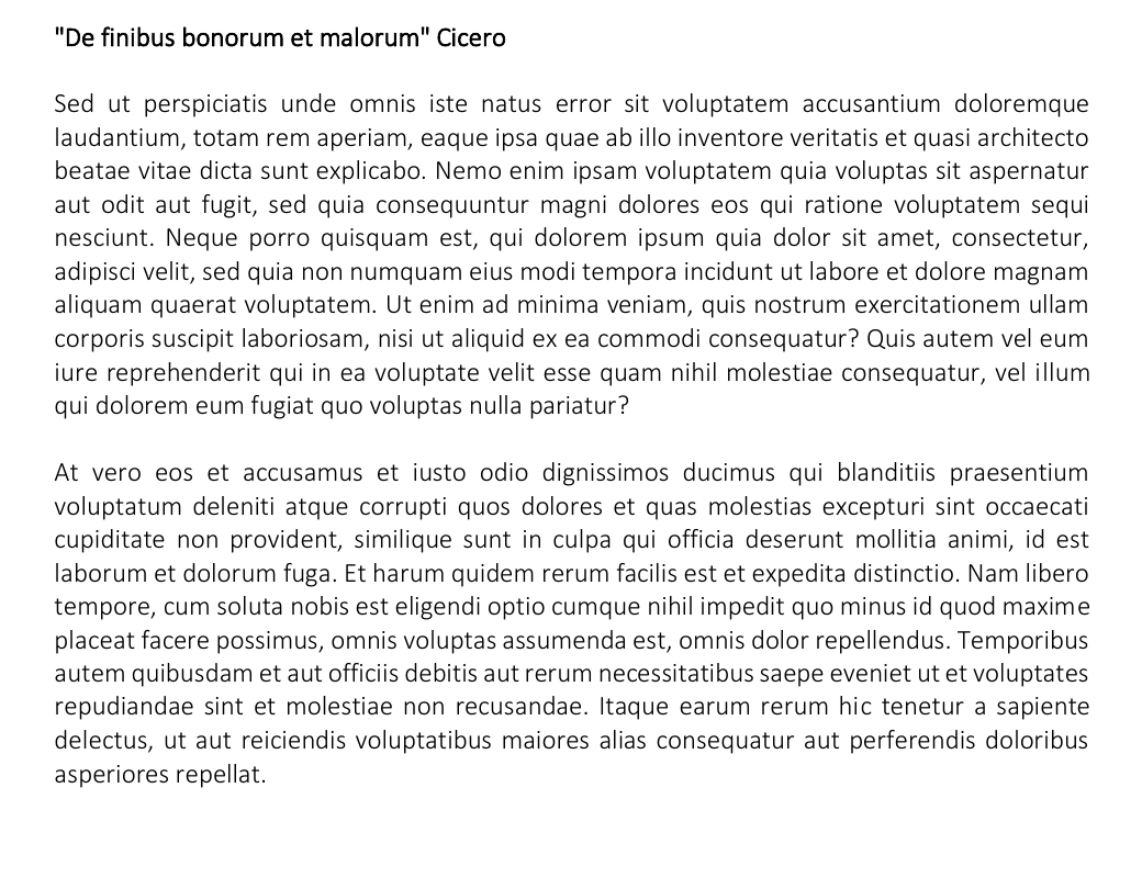
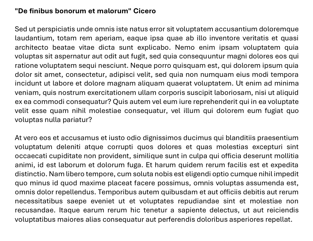
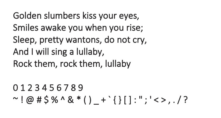
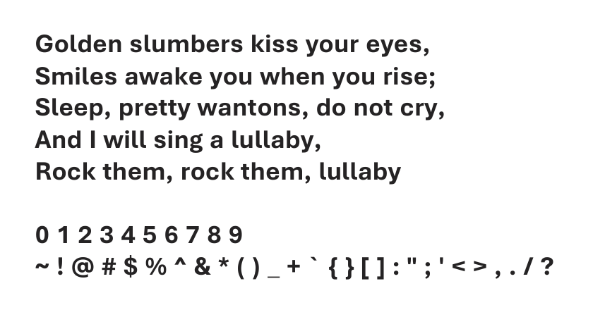
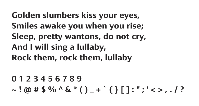
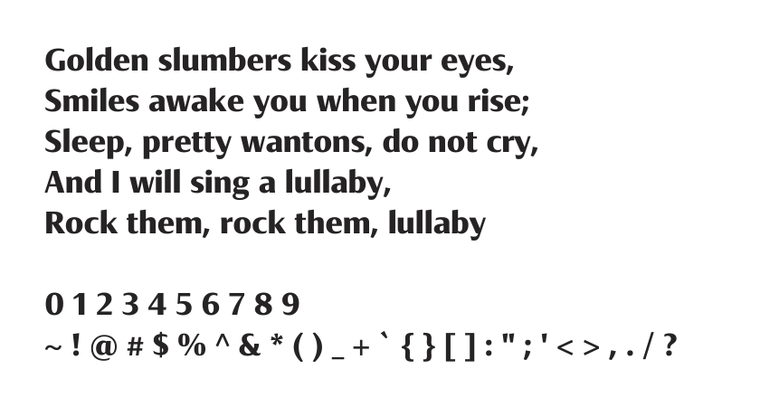
Here we start with two dense, justified Lorem Ipsum paragraphs at 12px. The display variants of each typeface, meant for being printed in larger formats, are shown as well, but due to space constraints on mobile devices I’ve decided to mark them with a * instead.
ℹ️ Remember you can use the arrow keys of your keyboard to quickly move between the different tabs in each comparison.
Lorem Ipsum Negative#
Normal Weight#


Normal Weight and Negative#


Bold#


Italic#


Bold and Italic#


Final Remarks#
I just realized Seaford has some serious weight differences at some seemingly random points where two strokes meet. Although I really like it, especially the display variant, these weight variations somehow bother me. Granted, those same weight differences give the font a somewhat enjoyable hand-written feel.

Weight variation at stroke joints in Seaford#
Acknowledgements#
In the two days following the publication of this post quite a few changes have been suggested and requested by folks all over the place. I’d like to thank @djmoyo on Reddit who advised I refer to stroke terminals as opposed to serifs despite the serif-y feel of Aptos. Same goes for @lel and @NomadicCoder on Tildes who suggested I reorder some of the figures and made me aware of the fact that I’d forgotten to add, trivial but still necessary, figure captions.
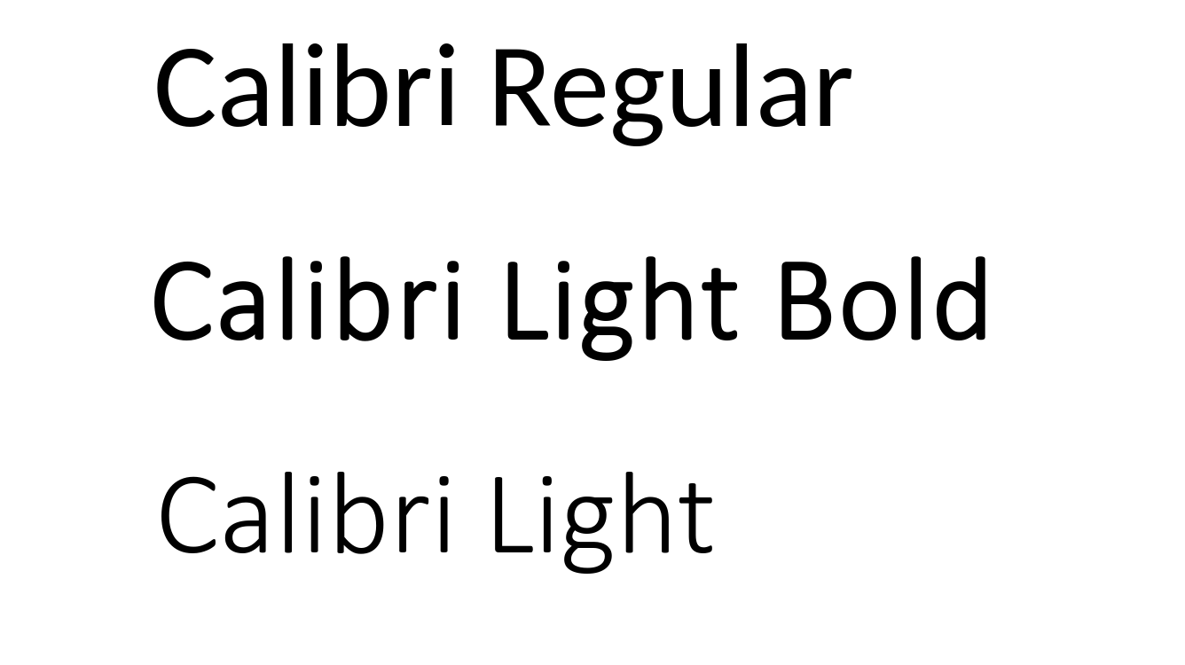
Finally, @djmoyo and @Phraaaaaasing pushed to investigate why Office 365 seemed to render some Calibri Regular characters using Lato Regular. After much debugging I could verify this was the case and the abnormal behavior didn’t affect Calibri Light. Interestingly enough, I could only observe this behavior when accessing Word and Power Point on Office 365 from Chrome, Chromium or Firefox on my Ubuntu system. It doesn’t seem to affect users accessing Office 365 from Chrome or Safari on MacOS nor Windows. The latter is expected, as Calibri is installed by default on Windows, but I wasn’t expecting MacOS to be unaffected. A feedback issue was opened with Microsoft shortly thereafter.
Office 365 Calibri on Different Operating Systems and Browsers#
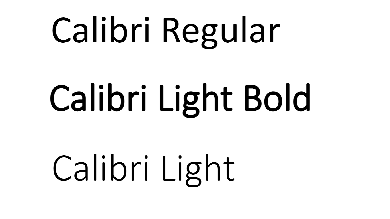
Calibri Regular, Light and Light Bold on Windows and Chrome
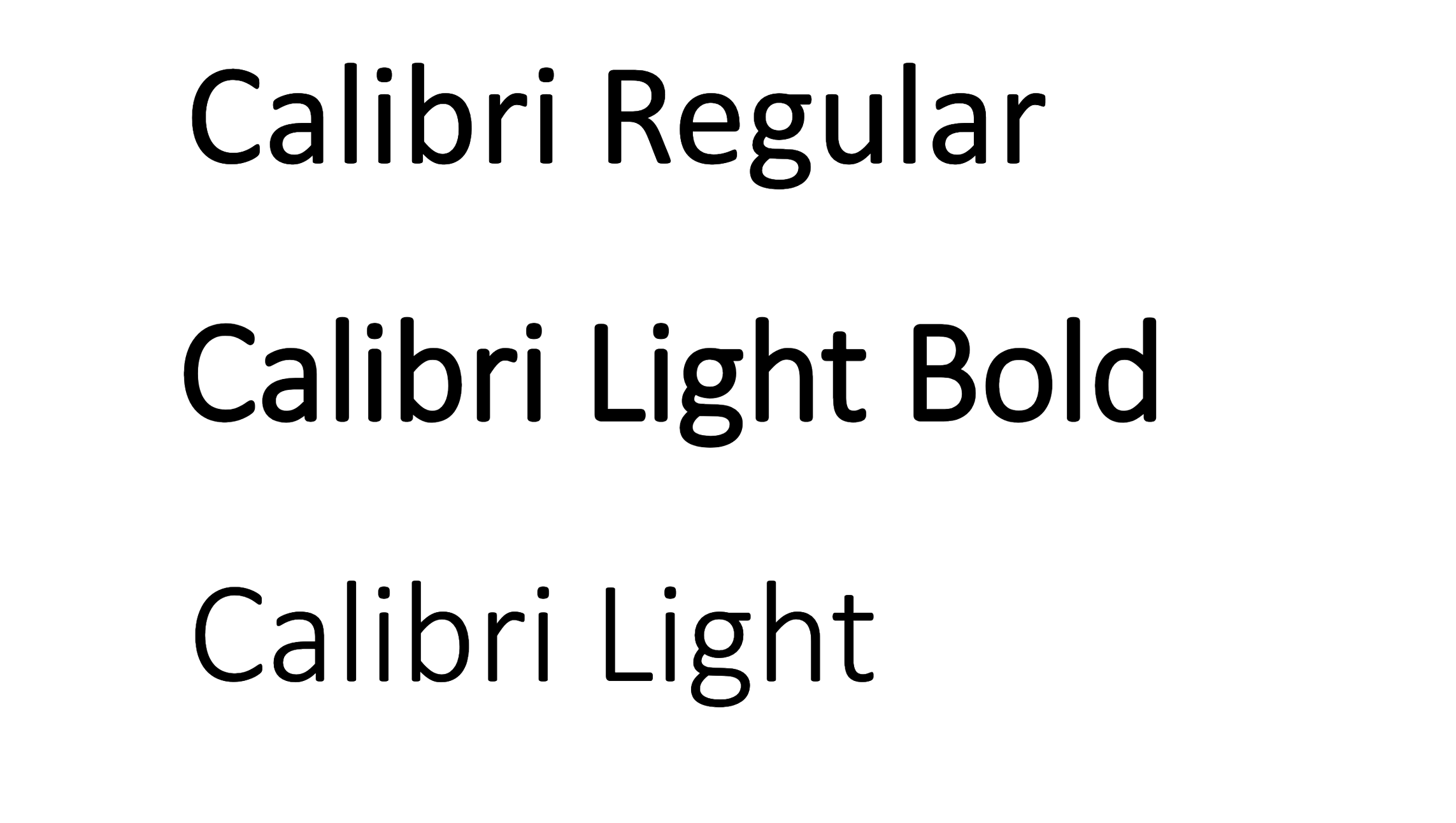
Calibri Regular, Light and Light Bold on MacOs and Chrome
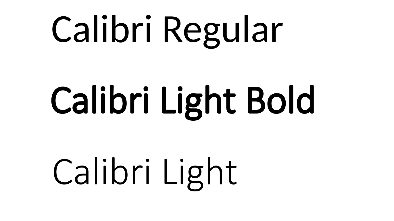
Calibri Regular, Light and Light Bold on Ubuntu and Chrome
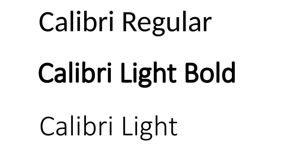
Calibri Regular, Light and Light Bold on Ubuntu and Chromium
Calibri Regular, Light and Light Bold on Ubuntu and Firefox
Funnily enough, the same issue also affects Microsoft’s feedback portal, although in that case it might be an intended behavior. After all, why transfer a font to the user’s browser if they already have one which is pretty close in looks. It begs the question, however, of why to offer typeface formatting at all.
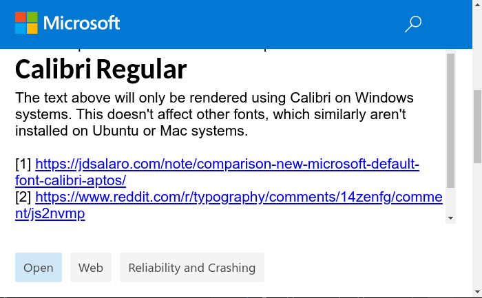
Calibri Rendered using Lato Regular Instead on Microsoft’s Feedback Portal#