🎭 Best Fonts for Programming#
It seems like there’s never enough time to be really passionate about aesthetics, so that’s why when the opportunity presents itself I just roll with it and indulge that inclination. This post is the result of one such opportunity.
Seeing as many of us spend a considerable amount of time in front of some sort of computing device, which is specially true for those of us who program, I wanted to put the list of my favorite programming typefaces out there for your enjoyment.
Addendum#
Once you’re done reading this article, you can continue by having a look at the related content I’ve linked below.
Introduction#
The decision regarding which font to use in your programming or scripting environment is one which, as far as I’ve seen, is mostly made implicitly by the Integrated Development Environment(IDE) or the Operating System(OS). If you’re an Ubuntu user, your system is likely to render this sentence using Ubuntu Mono, whereas for Windows and MacOS users it will probably be presented using Consolas and SF Mono respectively.
Nevertheless, humans, also programmers in case you were wondering :), are curious by nature and we learn early to challenge the status quo. By now I’m sure you are asking yourself which alternatives exist to the typefaces your OS, IDE, or console uses by default.
ℹ️ Although this list is not authoritative and caters to my preferences, I did try to make it useful by including fonts I wouldn’t personally use but which often come up while looking for alternatives online.
Discussion#
This article was discussed on Reddit ,Tildes, Mastodon and Lemmy.
Feel free to let me know in case you think I ought to include any other conversations related to this publication.
Initial Typeface Comparison#
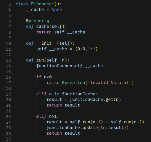
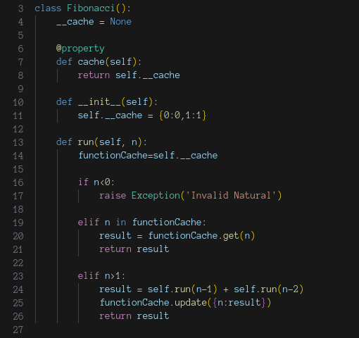
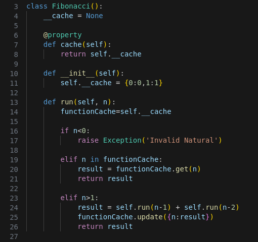
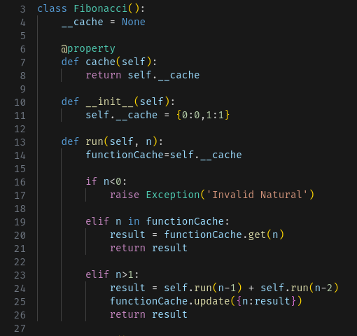
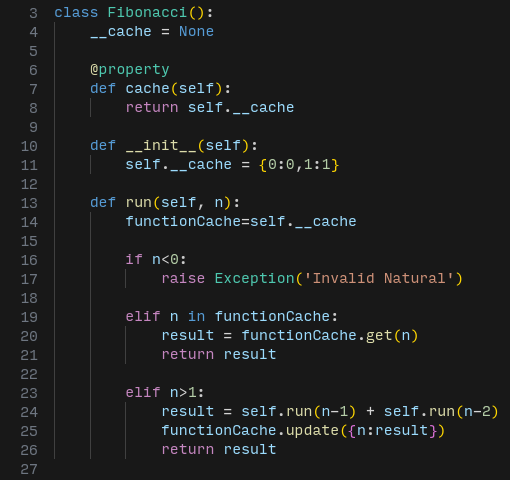
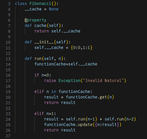
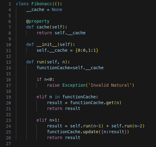
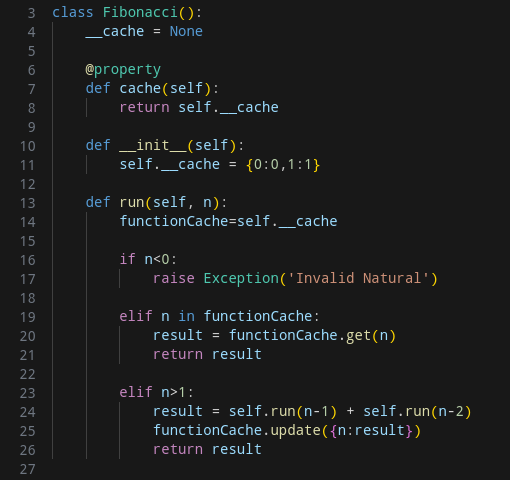
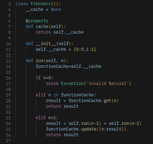
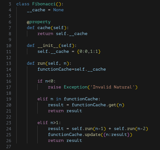
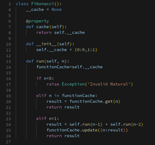
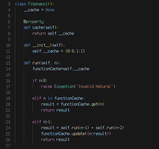
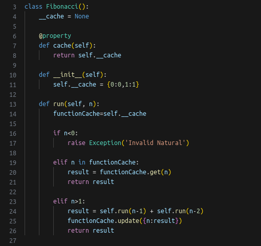
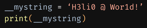
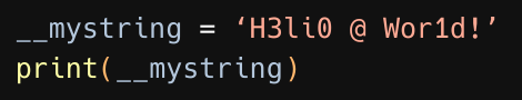
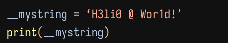
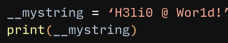
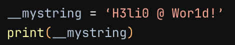
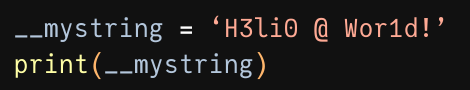
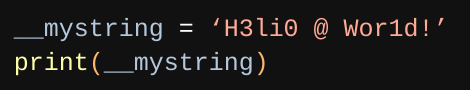
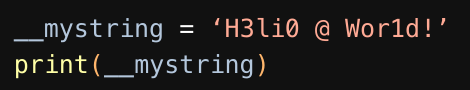
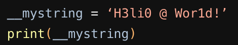
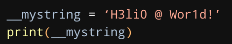
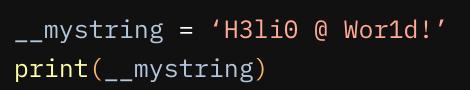
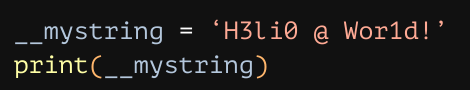
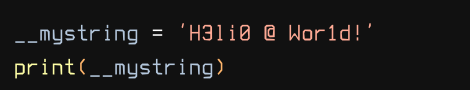
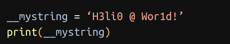
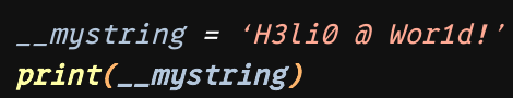
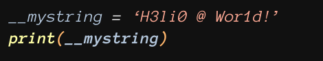
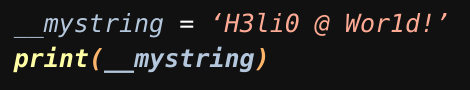
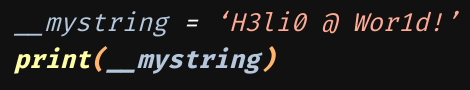
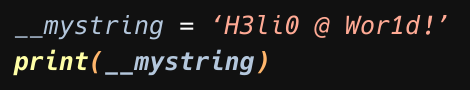
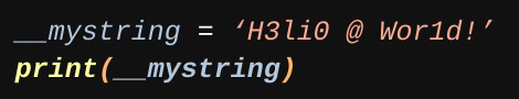
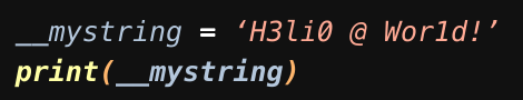
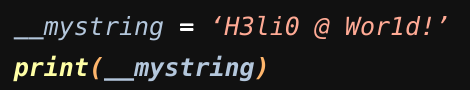
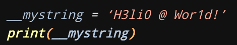
I struggled to find a format that was succinct, for writing and reading efficiency purposes, yet useful and clear. In the end I decided to go with tabbed comparisons of the same code snippets as rendered by VS Code in different typefaces at 14pt and regular weight; feel free to peruse them.
⬅️➡️ Remember you can use the arrow keys of your keyboard to quickly move between the different tabs in each comparison.
Code#
0xProto is a stunningly beautiful free and open source font, perhaps even too beautiful to be practical but it does have a considerable following. It’s the most curvy of the fonts presented here and supports ligatures.
Anonymous Pro is a font created by the Mark Simonson Studio with coding in mind, released under the Open Font License and thus freely available.
DejaVu Sans Mono is the monospaced family of the DejaVu fonts, a very extensive and freely available compendium of fonts.
Fira Code is a free monospaced font with ligatures (one-character representations for combinations such as == or !=) as well as numerous useful glyphs for command-line UIs.
Hack is “a workhorse” typeface for source code with deep roots in the free, open source typeface community expanding upon Bitstream Vera & DejaVu.
Iosevka is a narrow, open-source, sans-serif + slab-serif, monospace + quasi‑proportional typeface with an impressive support for other languages besides English.
Input Mono is system of fonts designed for code by David Jonathan Ross, it’s free to use for non-commercial purposes.

JetBrains Mono is a very complete typeface when it comes ligatures, non-latin symbols and weights.
Julia Mono is a typeface which contains a wide range of technical glyphs found in the sciences, lots of them.

Liberation mono is the monospaced variant in the TrueType Liberation font family.
Menlo, designed in 1997, was first shipped with Mac OS X Snow Leopard in August 2009. It superseded Monaco as the default monospaced typeface on macOS.

Meslo is a custom and freely available version of Apple’s Menlo.
Noto Mono is the monospace variant in the Noto font family comprised of over 100 different fonts.
Plex Mono is IBM’s official font family. Regardless of what you think of IBM, yeah I know, they really put a lot of work into Plex. Plex Mono is the monospace specimen in the very extensive Plex family. collection available via an Open Source License but also as part of the proprietary Adobe Fonts offering.
PT Mono is available via an Open Source License but also as part of the proprietary Adobe Fonts offering.
Source Code Pro, same as PT Mono, is available via an Open Source License and as part of the proprietary Adobe Fonts offering.
Terminus TTF is the TrueType version of the legacy Terminus; it’s a bitmap font which works very well for lower DPI screens.
Ubuntu Mono is the monospaced variant in the Ubuntu font family.
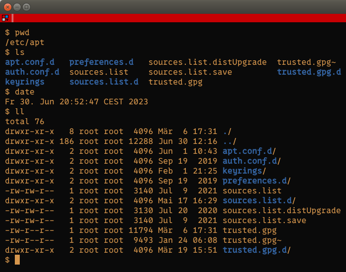
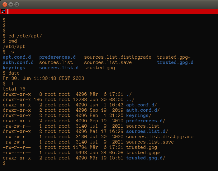
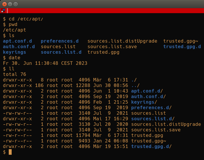
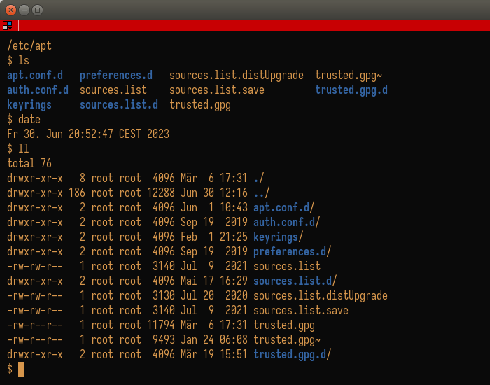
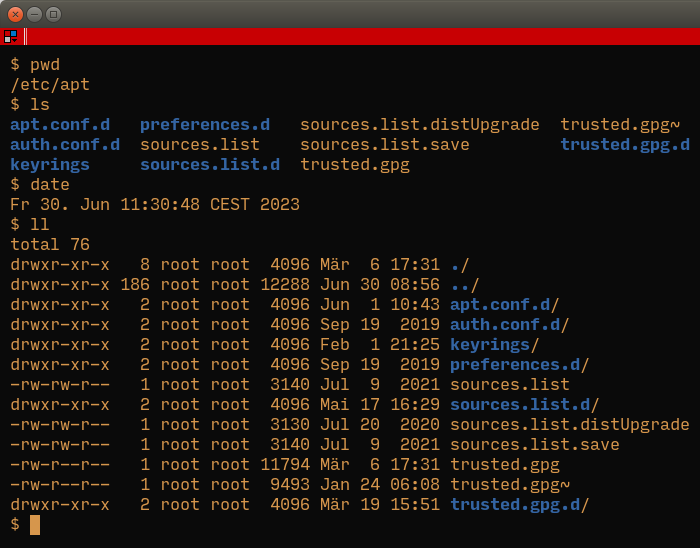
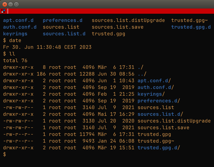
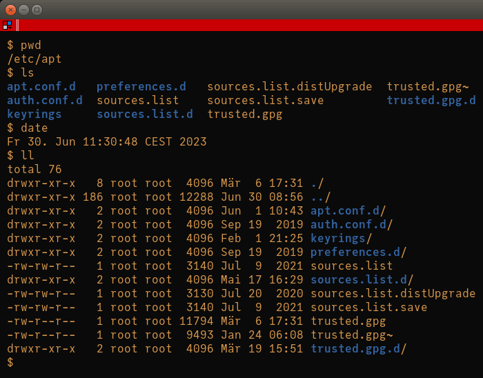
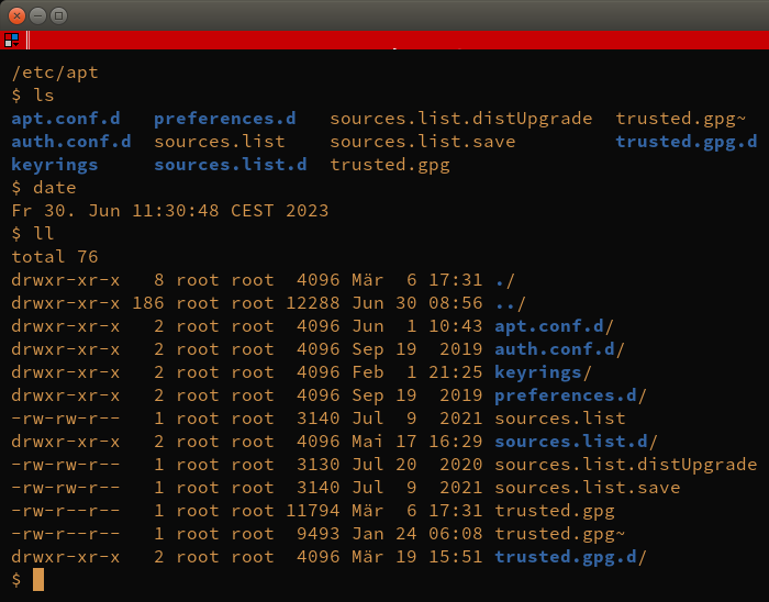
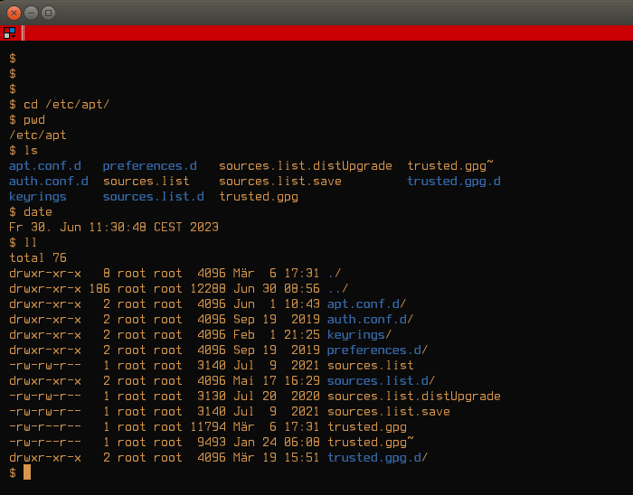
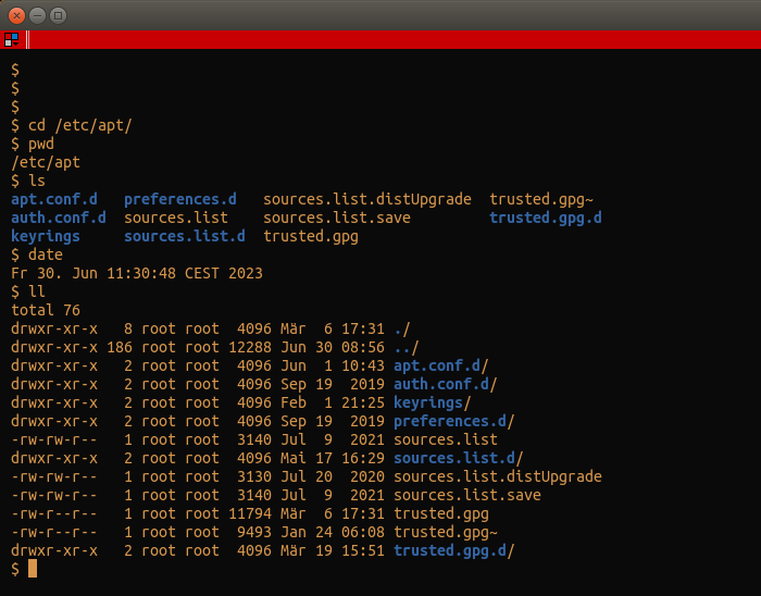
Terminal and Log Output#
In general, all of the fonts shown above should work fine for most purposes. I, however, have decided to rank them as to make it easier for those looking for a clear recommendation. Summarizing, you’ll notice that my favorite typefaces are not only pleasing to the eye, but also cover quite a few edge cases should the need for those arise: multiple weights, variable line gap support, ligatures, and more. Finally, this comparison would not be complete without mentioning terminal and log output, which is why you’ll find a tabbed pane with several terminal captures below.


Best Programming Fonts, a Biased Ranking#
Yes, both the rather simple Liberation Mono and the elaborate kitchen-and-sink JetBrains Mono work in the context of programming, scripting and while reading terminal outputs. Nevertheless, we should ask ourselves what we do with our editors and consoles such that some of the typefaces listed here would do better than the others. Having said that, review the tabbed panes above as this is your last opportunity to go through them without having your opinion tainted by my biases.
Fira Code#
(👑) Fira Code is one of my favorite programming fonts, partly due to the fact that it is based on Fira from the Mozilla Foundation. I enjoy its roundness, the big parentheses, highly placed quote symbols and similarity to SF Mono, Apple’s proprietary font, while I really dislike its at sign and the low weight and shortness of its quotes.
![]()
JetBrains Mono#
(⭐) JetBrains Mono is a well-rounded font family that has it all; including being backed-up by a company at the forefront of IDE design and development.
Julia Mono#
(⭐) Julia Mono is wild to me. It contains more than 10,000 glyphs and makes the sort of code possible that sends shivers down the spine of any programmer who doesn’t look back at their linear algebra days with fondness. You’re not sure what I’m rambling about?
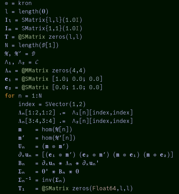
I must admit I’d like to personally use greek letters in my own code more often, but I find the constant keyboard map switching extremely inconvenient. I do, however, have multiple keystrokes mapped to common symbols, so I might try that approach in the future. Julia Mono is really good at representing subscripts, superscripts and mathematical symbols.
Ubuntu Mono#
(⭐) I find Ubuntu Monospace to be really appealing, it’s very round, almost too much, but I really enjoy looking at text and code rendered with it. It is, however, not very readable at small sizes as the spacing between glyphs is relatively low compared with for example Fira Code or Input Mono.
Input Mono#
(⭐) I have no real complaints regarding Input Mono, it’s one of my favorite typefaces for programming. The only possible drawbacks are its light weight and block-like appearance of its glyphs which compared to other typefaces might seem exaggerated. Input has the most prominent single and double quotes of the fonts listed here, and that’s a positive thing in my opinion, as most of the time they are more akin to elongated dots than actual short vertical lines.
0xProto, Plex Mono and Iosevka#
0xProto and Iosevka were completely unknown to me, they were mentioned in Mastodon discussion of this note and I decided to add them for two reasons.
0xProto is a very well made typeface, which I admit is also a tad too curvy and unconventional for my taste but beautiful nonetheless.
0xProto#
Iosevka#
Iosevka is an odd one out in this note as it is a narrow font and I would never have considered using one for reading or writing code! However, Iosevka is an impressive typeface with many weights, varying line gap specimens, an active community and a remarkable language support. I’m giving it a try and starting to like it.
Plex#
Finally, Plex was vaguely lingering in the back of my mind, but the font family is certainly well made; regardless of how over the top I find IBM’s marketing of it.
Anonymous Pro#
I like the way Anonymous Pro looks, but IMHO its serifs are too prominent which makes it hard to read for extended periods of time. Similarly, it’s weight is low and tends to make my eyes tired.
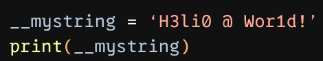
DejaVu Sans Mono#
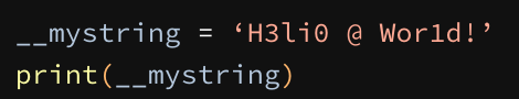
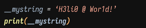
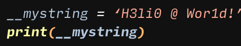
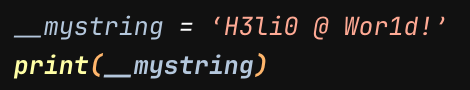
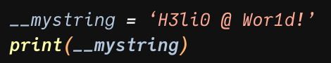
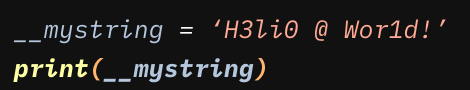
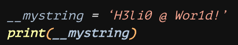
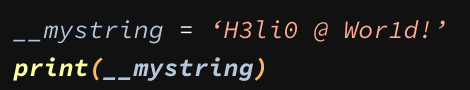
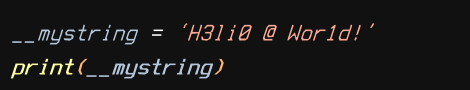
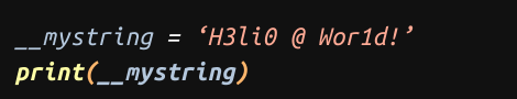
My only complain with DejaVu Sans Mono is the fact that two underscores __ look like one single prolonged underscore and they are placed too low. Seeing as under and dunder identifiers are actively used in Python to signify different things, fusing them together might be unnecessarily confusing and lead to errors. It’s worth noting that DejaVu, Fira, JetBrains and Iosevka, Liberation, Menlo, Meslo and Noto have the same problem.
Regarding Customization#
After discussing this topic at length with other folks I felt the need to add some remarks about typeface customization; since I used regular weights for every compared font purposefully abstaining from customizing them.
💡 Ease of use is definitely a feature, but versatility isn’t a bug.
This might have led to a slight bias against fonts such as Iosevka, Hack, Fantasque Sans Mono and Cascadia Code which are customizable to extreme levels. Whether you’re looking for lighter or heavier weights, alternative line gaps, ligatures, and more, you should not disregard them just because they didn’t make it into the top five. I’ve added some examples below to convince you :) .
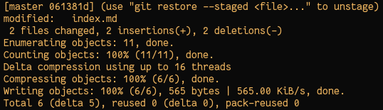
Stunning albeit remarkably “wobbly” and “curly” git output in Fantasque Sans Mono#
Extremely readable prose using Cascadia Code’s rather heavy regular weight#
Final Words#
I hope you enjoyed this post! I feel typefaces, color schemes and code highlighting are topics which are best treated together, but putting all those into the same note would be overly ambitious on my part and taxating to you.
Stay in touch by entering your email below and receive updates whenever I post something new:
As always, thank you for reading and remember that feedback is welcome and appreciated; you may contact me via email or social media. Let me know if there's anything else you'd like to know, something you'd like to have corrected, translated, added or clarified further.
Appendix#
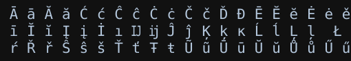
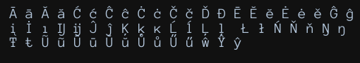
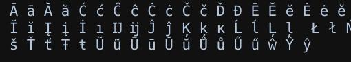
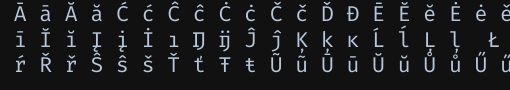
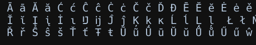
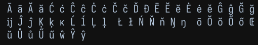
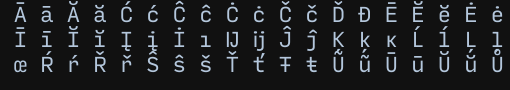
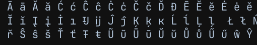
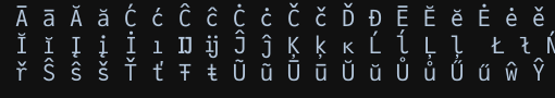
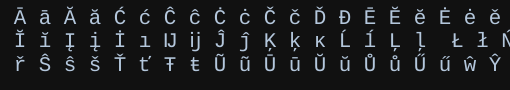
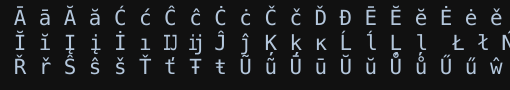
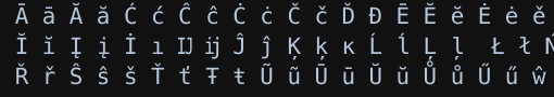
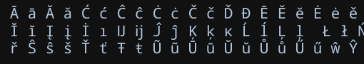
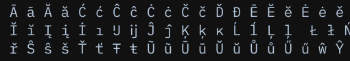
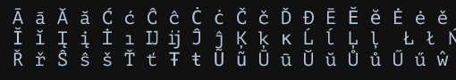
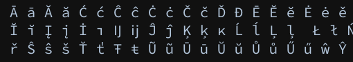
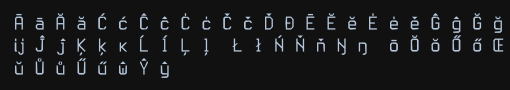
In case italics, boldface or extended latin glyphs are important to you, here you have some other basic comparisons you can use to help you decide.
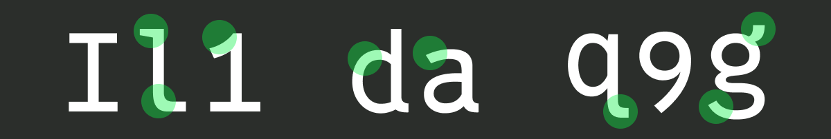
Zoomed-In | Code#
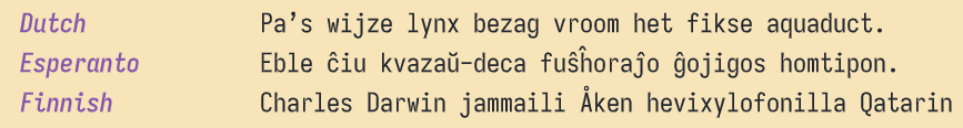
Zoomed-In | Italics and Boldface#
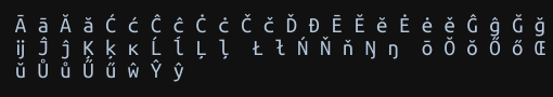
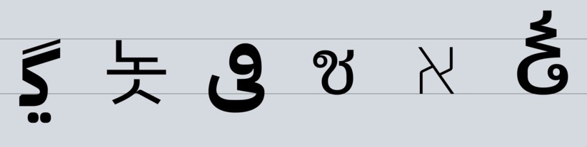
Zoomed-In | Latin Extended#